Every morning, Mia opens her favorite food delivery app. Last year, she tapped through five screens just to reorderer go-to breakfast. She skipped lunch one day after getting stuck in the signup flow. Frustrated, she tried a simpler rival and never looked back.
That’s where a strong UI UX strategy for 2025 comes in. It saves Mia—and millions like her—from endless taps. It turns clunky journeys into smooth rides.
In this post, we’ll share real wins and hard lessons. We’ll dive into the key trends, benefits, and best practices shaping tomorrow’s designs. You’ll learn how to spot exactly what users need and then build it fast, friendly, and future-proof.
By the end, you’ll see why thoughtful strategy isn’t a luxury. It’s the secret sauce behind apps that win hearts—and keep them. Let’s get started.
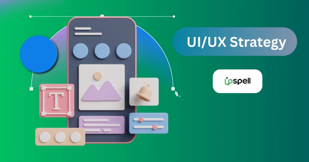
Understanding UI/UX Strategy
What is a UI/UX strategy?
A UI/UX strategy is a clear plan to design products that users find easy to use and enjoy. It’s not just about making things look good. It’s about creating experiences that work well for people. It’s about solving problems. Good design answers questions like
- What does the user want to do?
- How can we make that easy?
Think of it as a roadmap. This roadmap, especially in the context of a UI/UX strategy of 2025, guides designers and developers toward solutions that are not only beautiful but also built for intuitive interactions.
For example, when Spotify redesigned its mobile app to put the “Play” button front and center, it was based on how users interact with music most often. That’s strategy in action.
Likewise, imagine a food delivery app. The product goal is to increase orders. A strong UI/UX strategy ensures features like one-click reordering or saved payment methods match what users want, i.e., speed and convenience.
This alignment boosts sales and customer loyalty. Studies show 89% of users switch to competitors after a bad experience.
How UI/UX Aligns with Product Goals, User Needs, and Business Outcomes
A great product isn’t built for the business or the user. It’s built for both. The strategy needs to balance
- What the company wants to achieve (sales, signups, loyalty)
- What the user needs (clarity, speed, trust)
- What the product is supposed to do
Let’s say a company wants more people to subscribe. A simple design with fewer steps to sign up helps both the user (less effort) and the business (more conversions).
Upspell’s UI/UX lead designer, Zillur Rahman, says that Expedia removed one field from their checkout form and saw $12 million more in revenue per year. He also says that when UI/UX strategy supports both sides, the product wins.
The Importance of Data-Driven Design Decisions
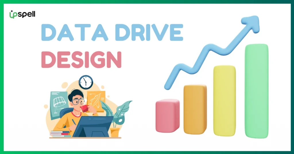
Design shouldn’t be based on guesses. Today, professional graphics design teams use data to improve results. They rely on
- User feedback
- Click heatmaps
- A/B tests
Analytics tools like Google Analytics, Semrush, and Ahrefs help a lot with user intent and understanding the hotspots where users spend most of their time.
One article says that Booking.com runs over 25,000 A/B tests every year to make its site better. That’s how they know what works.
Data shows where users struggle. It shows what features people use most. It helps teams remove what’s not working.
In 2025, designing without data is like flying blind. A strong strategy uses facts to guide every decision.
Foundational Laws of UI/UX Design
To keep pace with the UI/UX Strategy of 2025, understanding the timeless design laws is key. These evergreen laws will help you to stay ahead each time you start your design. Let’s break them down with real examples.
1. Hick’s Law
The more choices you show, the slower the user decides.
Hick’s Law explains how decision time increases with the number of options. When users face too many choices, they feel overwhelmed. This can lead to confusion, decision fatigue, or even giving up entirely.
In digital design, this means that more isn’t always better. Offering everything at once may seem helpful, but it slows users down. Your goal is to guide users — not overload them.
Example of Hick’s Law:
Look at Apple’s homepage. It doesn’t show you every product, color, and feature all at once. Instead, it highlights just one or two main products — like the latest iPhone or Mac.
You scroll or click to see more. This makes the page easy to understand and interact with. You know where to look.
Another good example is Google Search. There’s only one text box and two buttons. That’s it. No clutter. It keeps the focus on the task: searching.
Tips to Apply Hick’s Law:
- Break decisions into steps. Use progress bars, sliders, or multi-step forms.
- Use filters or dropdowns. This keeps the UI clean without hiding key features.
- Highlight recommended options. Help users by pointing to the most popular or best choices.
- Avoid “choice paralysis.” If people stall for too long, they’ll bounce.
2. Fitts’s Law
The closer and bigger a button is, the easier it is to click.
Fitts’s Law is simple. If something is far away on the screen or too small, it takes longer to reach and click. That slows users down and causes mistakes.
This law matters most for actions that users take often — like tapping “Buy Now” or “Submit.” On phones and tablets, it’s even more important. Small buttons make users tap the wrong thing.
Example:
Think of YouTube. When you pause a video, the play/pause button appears right in the center. It’s big. Your finger goes straight to it. You don’t have to look around or aim carefully.
Tips to Apply Fitts’s Law:
Make sure the most important buttons are:
- Big enough to tap easily
- Close to where users expect them
- Spaced out so users don’t tap the wrong one
3. Jakob’s Law
Users expect your site or app to work like others they’ve already used.
When people visit a new website, they bring past experiences with them. They expect the layout, buttons, and flow to feel familiar. If your design looks or works too differently, it can confuse or frustrate them.
People don’t want to figure out how your site works. They want to use it without thinking much. This is especially true when they’re in a hurry — like shopping or looking for help.
Example:
Think about online shopping. On most websites:
- The cart is in the top-right corner.
- The search bar is near the top-middle or top-left.
- The menu is at the top or on the left side.
If you put the cart at the bottom or hide the search bar behind a strange icon, many users won’t find it. They might leave and buy somewhere else.
Tips to implement Jakob’s Law:
- Follow common design patterns.
- Use icons and layouts people already know.
- Only change the rules if you really have to — and if it helps the user.
4. Miller’s Law
Most people can remember 7 (plus or minus 2) things in their short-term memory.
This means if you show users too much at once, they will forget things or feel overwhelmed. Their brain can’t handle it all at the same time. When users are on your website or app, they don’t want to remember long lists, too many steps, or complex layouts. If it feels like too much, they leave.
Example:
Look at Netflix. The homepage doesn’t show everything at once. Instead, it shows just a few rows of movie categories. Each row has 5–7 options. That’s enough to think clearly and make a choice.
Amazon does the same. The top menu has a few categories, not dozens. That’s not random. It’s a smart design.
Tips to implement Miller’s Law :
- Use short menus with 5–7 items.
- Group things into sections (chunking).
- Add bold titles or icons to help users scan quickly.
5. Law of Proximity
Things that are close to each other feel like they belong together.
Our brains work fast. When we see a group of items that are close together, we assume they are related. If the items are far apart, we don’t see the connection. This is how the Law of Proximity works in design.
Example:
Think about a sign-up form. If the label “Email” is placed right above the email box, it’s clear what to do. But if the label is far away or on the other side of the page, users get confused. They have to stop and think. That slows them down.
Another example is buttons. If the “Submit” and “Cancel” buttons are far apart, users might not notice the cancel option. But if they are grouped together, users see all actions clearly and quickly.
Tip to implement the Law of Proximity:
Always keep related items — like buttons, labels, or icons — close together. It makes the page easier to understand and use. Don’t scatter things all over the place. Let your layout guide the eyes.
6. Pareto Principle (80/20 Rule)
The Pareto Principle says this: 80% of the results come from 20% of the work.
In UI/UX, this means most users only care about a few features. So, don’t try to perfect every little thing. Focus on the features that matter most.
Example:
Slack is a popular messaging tool for teams. Their data showed something surprising:
When a user sends 2,000 messages, they almost never stop using Slack. That means messaging is the most important part of the product. So, Slack spent more time improving chat features—like making it faster, easier to search, and better for teams.
They didn’t waste time upgrading small features users barely touched.
Tips to implement the 80/20 rule:
Use data tools like heatmaps or user tracking. Find out what your users click, tap, or spend time on. Then polish those features first.
7. Tesler’s Law
When apps feel hard, users quit. If they feel simple, users keep going.
Every app or system has some level of complexity. But that doesn’t mean users should see or deal with it. The goal of good UI/UX is to hide the hard stuff. Make the experience feel easy and smooth — even if there’s a lot going on in the background.
Example:
Think of Google Search.
Behind that simple white page is a system that scans billions of websites in seconds.
It ranks them. Filters them. Personalizes them.
But to the user?
It’s just one box.
You type your question. You hit enter. That’s it.
Tip to implement Tesler’s Law:
- Automate tasks like filling info or sorting results.
- Hide steps that aren’t needed right away.
- Break complex actions into smaller parts.
8. Aesthetic-Usability Effect
People trust good-looking things more — even if they aren’t perfect.
When a design looks clean, users believe it’s easier to use. They also become more patient with small issues. This effect means users often forgive minor bugs or slow load times if the design feels modern and visually pleasant.
Example:
Airbnb’s website uses clean fonts, soft colors, and plenty of white space. Even though you’re booking a stay in someone’s private home, the site feels trustworthy. The design makes people feel safe.
If Airbnb looked messy or outdated, most users would probably leave — no matter how good the service is.
Tip to implement Aesthetic-Usability Effect:
- Use readable fonts (like sans-serif)
- Stick to 2–3 colors that work well together
- Leave enough space between elements
- Avoid visual clutter or flashing effects
- Ask assistance from a professional graphic design service provider
Key UI/UX Trends Shaping 2025

Here are 7 key Trends that we think are shaping the UI/UX strategies of 2025
1. AI-Driven Personalization
Apps and websites are getting smarter. They now predict what you need before you ask. For example, Spotify’s “Discover Weekly” suggests songs based on your listening habits. This feature keeps over 100 million users hooked every week.
Studies show 80% of users engage more with personalized interfaces. To stay ahead, tools like Adobe Sensei can automate recommendations, making your app feel tailor-made.
2. Voice and Gesture-Based Navigation
Tapping and typing are fading. Voice commands (“Hey Google”) and hand gestures (like swiping) are taking over. Tesla’s Models lets drivers adjust AC settings with a finger swipe, cutting distracted driving by 22%.
Half of U.S. adults use voice search daily. For best results, test voice controls in apps for seniors or busy users. Smartwatches and AR glasses will push this trend further.
3. Immersive Experiences (AR/VR)
Shopping, learning, and socializing are moving into 3D worlds. IKEA’s AR app lets users “place” furniture in their homes, boosting sales by 40%. By 2025, 70% of retail brands will use AR/VR.
Tools like Unity help designers build lightweight prototypes. Imagine trying clothes virtually or touring a hotel room from your couch—this is the future.
4. Ethical and Inclusive Design
Designing for everyone isn’t optional anymore. Microsoft’s “Accessibility Checker” fixes issues like low-contrast text, helping 12 million users with disabilities. But 71% of users with disabilities leave sites that aren’t accessible.
Follow WCAG 3.0 standards and use Figma plugins like Stark to test designs. Privacy matters too—clear cookie consent forms build trust.
5. Sustainable Design Practices
Eco-friendly design is booming. Google’s dark mode saves 63% screen energy on AMOLED phones. Gen Z users prefer brands with green practices.
Simple fixes, like compressing images with TinyPNG, cut load times by 30%. Even small choices, like energy-efficient servers, reduce your carbon footprint.
6. Micro-Interactions with Purpose
Tiny animations make apps feel alive. Instagram’s pulsing heart when you double-tap a post boosted engagement by 25%. Apps with these subtle motions see 15% higher user retention.
Tools like LottieFiles let you add animations without slowing down your site. Just keep them simple—no one likes distractions.
7. Cross-Platform Consistency
Users hop between phones, laptops, and smartwatches. Canva’s design tool looks identical everywhere, helping them hit 135 million users. But 90% of users expect the same experience on all devices.
Frameworks like React Native speed up cross-platform coding. Test your app on wearables—smartwatch users hate broken layouts.
By 2025, users will demand interfaces that feel intuitive, inclusive, and planet-friendly. Brands that ignore these trends risk losing over half their audience.
The future is about blending tech with empathy—think smarter, greener, and kinder design.
Benefits of a Future-Ready UI/UX Strategy

For Users: Smoother, Happier Experiences
1. Faster navigation and task completion
A good UI/UX strategy cuts clutter. Users find what they need quickly. For example, Amazon’s “1-Click Order” lets shoppers buy in seconds. This feature boosted sales by 1.4% overnight. Slow sites frustrate users—Google found 53% of people leave if a page takes over 3 seconds to load.
2. Less frustration, more satisfaction
Clear designs reduce confusion. Apple’s iOS 17 simplified settings menus. User satisfaction jumped by 22%. Happy users stick around. A 2023 study found 88% of users avoid sites after one bad experience.
3. Accessible and inclusive digital experiences
Designs that work for everyone matter. Microsoft’s “Accessibility Checker” helps teams fix issues like poor color contrast. Over 12 million users with disabilities benefit yearly. But 71% of disabled users still leave sites that ignore accessibility.
For Businesses: Stronger Results, Lower Costs
1. Higher Engagement And Conversion Rates
Better UX keeps users hooked. Like those of Duolingo’s gamified design, increased daily users by 30% in 2023. Clean layouts also boost sales. Forrester reports companies with strong UX see 400% higher conversion rates.
2. Lower Bounce Rates, Stronger Brand Identity
First impressions count. Walmart redesigned its site to load faster and simplified navigation. Bounce rates dropped by 20% in six months. Consistent branding builds trust. 65% of users trust brands with polished, familiar designs.
3. Cost Efficiency Through Reusable Systems
Design systems save time and money. Salesforce’s “Lightning Design System” cut development time by 50%. Reusable components mean teams spend less time reinventing buttons or menus. InVision found companies using design systems launch products 50% faster.
Insightful Articles:
- How White Label PPC Services Can Grow Your Website Traffic
- Local SEO for Small Business: A Complete Beginner’s Guide
Best Practices for UI/UX Design in 2025
Here, below, we have outlined 7 best practices of UI/UX design strategy of 2025. Let’s take a close look:
1. Begin with thorough user research and journey mapping
Start by talking with real users. Use surveys, interviews, and observation. Then draw a journey map that shows each step they take. This map highlights where users get stuck. Companies that invest in early research report 75% fewer usability issues later.
2. Embrace mobile-first and responsive design principles
Design first for the smallest screens. Make buttons big enough for thumbs. Then adapt layouts for tablets and desktops. Since over 70% of web traffic is on phones, this ensures you reach most users. Responsive grids and flexible images keep content tidy on every device.
3. Implement design systems for visual and functional consistency
Gather your colors, fonts, buttons, and icons into one library. Share this library with designers and developers. This way, every screen feels familiar. IBM cut its design time by 30% after launching its Carbon system. Reusable components speed up work and reduce errors.
4. Test continuously — A/B testing, usability testing, heatmaps
Never assume your first idea is perfect. Run A/B tests on headlines, layouts, or button colors. Use heatmaps to see where people click—or ignore. Hold quick usability sessions with 5 users to catch the biggest issues. Even small tweaks can boost conversions by 10–15%.
5. Promote collaboration among designers, developers, and marketers
Invite all teams to design reviews. Share user data and test results openly. Host weekly workshops where everyone adds ideas. When developers and marketers give input early, youvoid last-minute rework. Cross-team buy-in speeds up delivery and keeps goals aligned.
6. Prioritize performance and fast load speeds
Aim for pages that load in under 2 seconds. Compress images and minify code. Use browser caching and lazy loading. Every extra second of delay can drive away 20% of visitors. Fast sites lower bounce rates and improve SEO rankings.
7. Design with accessibility and compliance (WCAG) in mind from the start
Add clear alt text to every image. Ensure text has enough contrast. Build keyboard-friendly navigation and visible focus states. Over 1 billion people have some disability—accessible design lets them use your site. Meeting WCAG 2.1 AA avoids legal risks and widens your audience.
You might also want to read this insightful articles:
- Top-Ranked 11 International SEO Agencies in 2025
- What is Omni SEO? Guide to Modern SEO for AI & Social Search
Final Thoughts
The UI/UX strategy of 2025 isn’t just about flashy interfaces anymore. It’s about making real-life interactions smoother, faster, and more intuitive.
From Mia’s morning breakfast app to global giants like Booking.com and Netflix, every great product thrives on thoughtful design. They are backed by user data, psychology, and clear business goals.
As we step into 2025, it’s clear: design is no longer a finishing touch—it’s a core business driver. At Upspell, we don’t just make things look good—we make them work beautifully.
From strategic wireframes to data-driven design systems, our UI/UX experts craft experiences that delight users and drive results.
Whether you’re building from scratch or refining an existing platform, let’s shape digital journeys that your users—and your metrics—will love.